

Amozi Theater
Designing an app that makes it easier and quicker for movie-goers to order concessions.

Project Overview
As part of my Google UX Certification, I was tasked with designing an app for moviegoers to order concessions at a small neighborhood theater.
I was the sole designer for the end-to-end design process.
In this case study, I’ll detail the process of designing an app that provides moviegoers with a simple, streamlined process for ordering snacks at the movies.

How will designing a snack ordering app alleviate pain points for moviegoers?
Understanding User Goals
I wanted to learn more about the current process, successes, and challenges that moviegoers experience when ordering snacks at the theater, so I could better understand how to create an effective solution.
Conducting User Research

I conducted a research survey with 13 participants to learn more about current processes and pain points. Then, I conducted interviews with 5 participants to dive deeper into some of the needs and preferences moviegoers have when ordering snacks at the movies.
I asked questions about participants’ backgrounds, their current process for placing orders, how that process impacts their experience, and some of the important aspects of ordering effciently and accurately
Identifying Actionable Insights
My user research revealed that the biggest challenges for movie-goers were:
1. Costs are too high. Moviegoers want to be able to save money
2. Lines are too long. Users want an easier and quicker way to order snacks so they can avoid the long lines and plan their arrival times better
3. Options are too limited. Users want to be able to customize orders and add special requests.
How are similar snack ordering apps solving these pain points for moviegoers?
AUDITING COMPETITORS
Before starting my ideation process I performed a competitive audit of 3 existing apps with similar users and goals.
With the needs and wants of my users top of mind, I thoroughly reviewed each competitor, focusing on the following areas:
General information about the competitor and their target markets
App interaction, including available features, accessibility, navigation, and user flow
App visual design and brand identity
App Content, including tone, descriptiveness, and product offerings

How might we improve the ordering process for concessions so that moviegoers can enjoy snacks that suit their dietary needs, avoid lengthy delays, and save money.


Sketching Solutions
Here are a few of the features and concepts that I began working on to support these needs
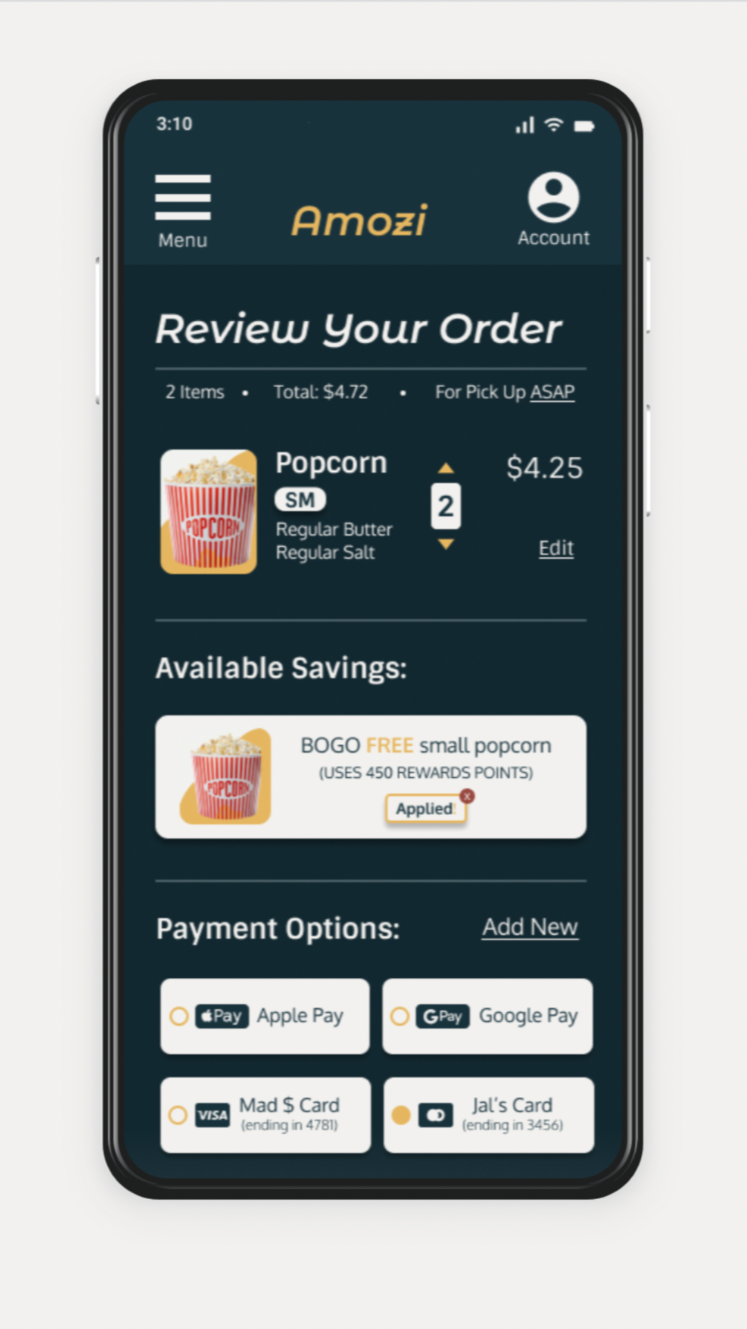
A rewards system so earn and redeem points to make concessions more affordable
The ability to place an order for pickup ASAP or schedule an order in advance
An option to add special customizations or requests to an order
Highlighting Key Features
Next, I created high-fidelity designs for these features to show the details of their functionality, and how they might support user goals throughout the ordering process.
Adding Rewards
Many users wished there was a way to earn and redeem rewards to aid in lowering the cost of ordering concessions. Based on this feedback, I designed a “Redeem Rewards” feature on the checkout screen so users could select which reward they’d like to redeem for each order.
Adding Pickup Options
Another major pain point for users was having to wait in long concession lines. This made it difficult to plan arrival times and often lead to users feeling stressed and/or missing parts of the movie. To solve for this problem, I designed an option to order snacks for pickup ASAP or schedule an order for pickup in advance. This would enable users to skip the concessions lines entirely, making it less stressful and time consuming to get their concessions.
Adding Special Requests
Many users noted that while they liked the ability to order in other apps, they were often frustrated by the inability to customize orders when ordering in an app. Based on this feedback, I designed more customization options on the food item cards as well as included a “Special Requests” field for users to add any additional customizations.
How well do these solutions actually meet the needs of users?
THE PLAN
This research plan shows the methodology, key objectives, and KPI's of my usability study. It also includes a detailed script of the prompts and questions I asked each participant.
My main goal was to determine if the app was easy to use and if there are any features missing or any current features that caused difficulty for users.

THE RESULTS
Once all of the participants completed the usability study, I watched the recordings and took detailed notes on each participants click path, reactions, completion rate, and quotes for each prompt.
I then created an affinity map using Miro to identify 7 main feedback themes and prioritized them based on a severity rating scale. The four pain points below were prioritized as crucial fixes for the next iteration of the Amozi app.

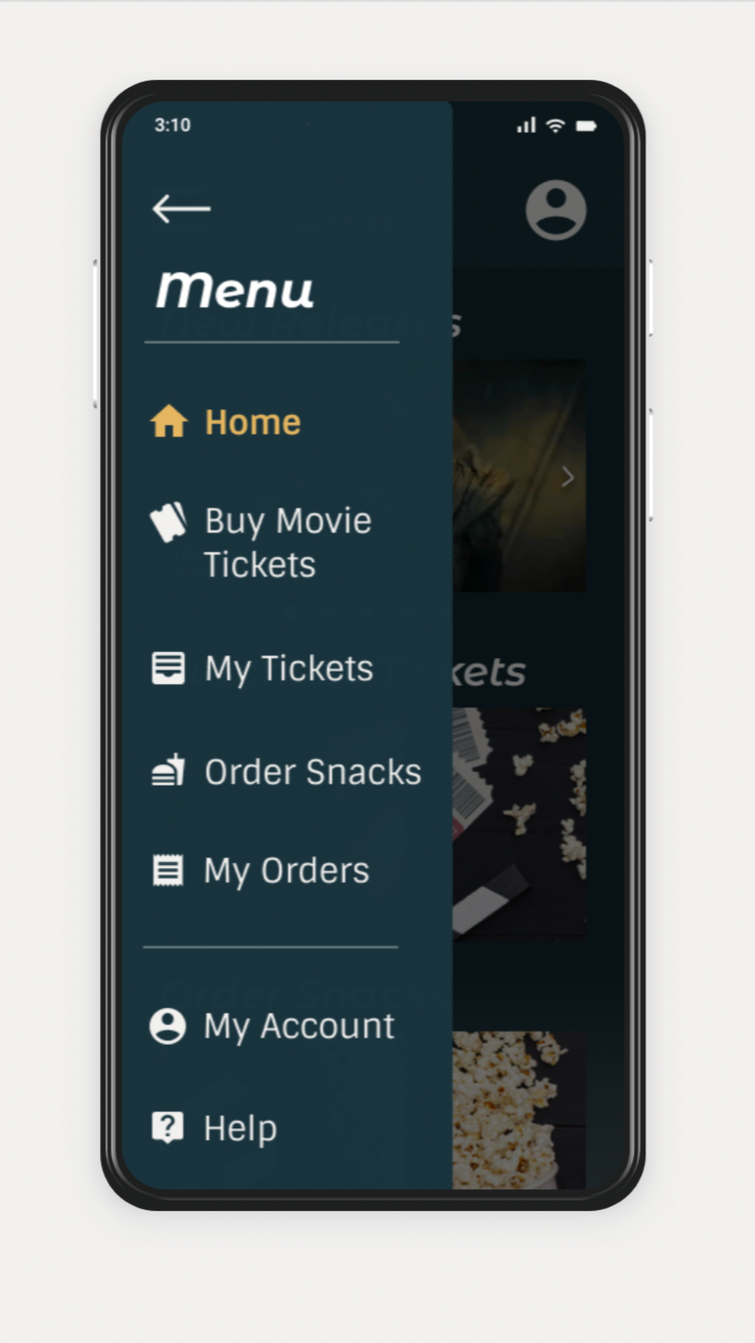
HOMEPAGE CONFUSION
Users were confused that the movie showtimes page acted as the homepage. Many thought that they had to purchase tickets before they could order snacks in the app.

MAIN MENU DIFFICULTY
Most users experienced difficulty with the main navigation bar because it sometimes fell below the fold. Many users wished it was fixed at the top of the screen.

BUTTON STRUGGLES
Many users had issues clicking buttons, noting that the clickable area of the buttons was often too small. This prevented some users from completing certain tasks.

PAYMENT OPTIONS
Some users expressed concern over providing their card details in the app. They wanted more safe payment options and all payment de-selected by default.
FINAL DESIGN
UPDATING THE WIREFRAMES
Here you can see the updates made to the original wireframes to address the issues around homepage confusion, main menu difficulty, button challenges, and payment options that users experienced during the usability study.

Simplifying the homepage by removing showtimes and adding quick links.

Anchoring the menu to the top of the screen so it never falls below the fold.

Appropriately formatting and enlarging buttons so they’re easier to click.
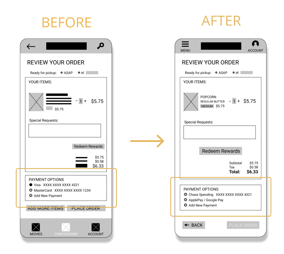
Including safe payment options and de-selecting all payment by default.
THE FINAL WIREFLOW
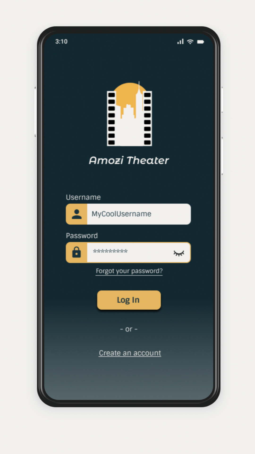
The following wireflow shows the updated screens that a user would progress through in order to sign up or login to the app and complete the following:
Ordering snacks for pickup (primary user journey)
Purchasing movie tickets (secondary user journey)
Accessing their account and managing account settings
Reviewing past ticket purchases and snack orders


What key takeaways did I gain from this project and what are the next steps?
TAKEAWAYS
This was my first end-to-end mobile app design using Figma and it was certainly a learning process. Early designs had a lot of inconsistencies and my initial lack of Figma knowledge when creating the lo-fi prototype (like not knowing how to fix the main menu to the bottom of the screen) caused some issues during the usability testing.
The brand and style guide created in the early stages of this project also presented a few design challenges, particularly around accessibility in the early mockup iterations. After completing this project, I took several Figma trainings and enrolled in a typography and design course to help close the knowledge gaps identified during this project.
NEXT STEPS
If this app was truly going to market, I’d want to work with developers and stakeholders throughout the entire design process to determine whether implementing these solutions is actually feasible from a development standpoint and how these features would impact business goals.
Next steps would be to conduct another round of usability testing to see how well the hi-fidelity prototype meets the needs of real users. Additionally, there were several insights from the first usability test (e.g., adding the ability to order snacks for delivery to your seat) that were prioritized for later iterations and would need to be incorporated into the designs before working with the Dev teams to bring the app to life.

Thanks for checking out this case study!
Here are some other projects you might like:

Designing an interactive simulation to educate and engage non-profit stakeholders so that they feel more connected and impactful in their advisory positions.

Creating 95+ recipes and designing a cookbook to share my favorite recipes from a year of backpacking around the world.

[COMING SOON] Designing a responsive networking site to provide a collaborative space for doctors to grow their networks, get second opinions on challenging cases, and stay on top of breaking research.